Email marketing is one of the most effective ways to reach your customers. However, if your email newsletters are not well designed and executed, the mistakes can be costly. Here are five examples of what not to do in your email newsletter.
5 Examples of What Not To Do in Your Email Newsletter

1. INFERIOR SUBJECT LINES
Your subject line is your first (and sometimes only) chance to make a good impression. Grabbing your reader’s attention is essential. If your subject line isn’t up to par, your open rates will suffer. Readers will delete the email without ever looking at what’s inside.
Make sure your subject line is interesting, specific, and reflects the content within. Remember to keep your subject line within 30 characters so it appears properly across email providers.
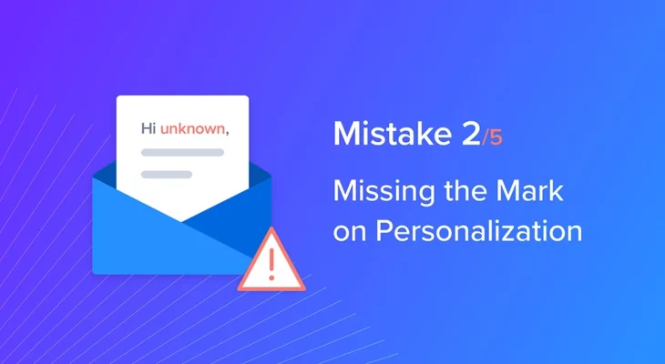
2. MISSING THE MARK ON PERSONALIZATION
Customers want personalized experiences, and they’re more likely to engage with emails that address them by name, so when companies include a personalized greeting, they’re on the right track. Unfortunately, mistakes are sometimes made in execution.
For example, some subscribers to one company’s newsletter did not have a first name associated with them, and the company failed set up a default to address the problem. As a result, those subscribers received emails with the greeting, “Hi unknown.”
It’s a good idea to make sure your email is set up to omit the personalized greeting when names are not provided. That way, you’ll avoid making a similar mistake.
3. POOR DESIGN
Including too many graphics, contrasting colors, or a large volume of text makes your newsletter unappealing and overwhelming to the reader. Focus on just a few points and break text into small paragraphs or bullet points.
Your design should be simple and clean. If you want to feature products, only choose the most relevant ones for that customer, and don’t overload the email with graphics.
Newsletters should take fewer than three minutes to read. Otherwise, you’re likely to lose your reader’s attention. Try including summaries and links or adjusting how often you send newsletters if you feel like you can’t fit all the relevant information in.
4. TOO MANY LINKS
The vast majority of users now switch between devices throughout the day. That means you need to consider how your email will appear on computers, tablets, and mobile phones. Including too many links can be problematic, especially on smaller screens.
Readers should be able to scroll through your newsletter without accidentally clicking on links. Similarly, they should be able to easily click one link without hitting others nearby.
Think carefully about which links you really need and leave plenty of clearance around them. That way, readers can use them to get more information or respond to your CTA without the frustration of trying to avoid other links in the process.
5. BAD PLACEMENT OF THE CTA
Many newsletters fail to include a call to action early in the email. If you wait until the end of the text, your reader may have lost interest. Consumers often skim emails and may stop scrolling before they reach the bottom.
Instead, your most compelling content and CTA should be placed near the beginning of the email, where you’re more likely to engage your reader. As with links, make sure your CTA button is easily visible and has plenty of space around it.
Email newsletters are one of the best ways companies can engage with their customers. If you’re ready to take your newsletter to the next level, Blueshift can help. Our simple user interface creates multiple recommendation schemes and allows you to target every user interaction. Learn more about what Blueshift can do for you, or contact us.


