n this series, we cover the common pitfalls all marketers face at some point when scaling personalization in their triggered marketing. From emails to mobile push notifications to SMS to display retargeting, the common platforms used today to market across channels begin to lose efficacy when organizations try to personalize their communications to an ever more complex and growing customer base.
Avoid Personalization Pitfall # 5: Ugly Personalization!

Personalization Can Get Ugly
Please, stop sending ugly emails…especially if you are going through the trouble of personlizing them. (Strike that, just don’t send ugly emails.)
Marketers using legacy systems often find that they are unable to combine “automation” with “creative” in these systems. As a result, some of the automated messages delivered by these legacy systems look ugly & “too automated” instead of personalized and delightful.
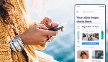
The inconsistency originates from using systems that are so complicated that the marketers have to pull in the IT and design team to execute a certain responsive ad or email and the creativity of the marketer is left behind. The customer should have a visually consistent experience as they move from one channel to another. Be it your website, app, push notification, or email, the same unique look should come across in every touch point.
SIMPLE, CLEAN DESIGNS DELIGHT
n our experience with billions of emails and hundreds of email designs it is evident that the cleaner, simpler, and more seamless layouts get the highest CTRs and conversion rates. The goal of reaching out to customers is to delight them with a message that will bring them back to your site rather than drive them away with ugly looking emails or push notifications.
Here is an example of an email with a poor personalization design:

This is a welcome email for signing up with Sheplers website. First thing you notice is that you cannot tell what they sell from this email. There is no mention of my name to make this personal. There are no images of products that catch your eye or a call to action. Overall this email does not provide much value to the customer.
Here is an example of a nicely designed, personalized email:

This birthday email from LaserAway is a good way to bring back customers to your store or just staying on top of mind. There are exclusive offers and discounts to take advantage of specifically for the birthday week. There is an urgency and promotion that customers can act on.
When designing your emails, ask yourself if it is something YOU would like to receive. Or ask your team mates, friends, or your mom. Just please, don’t design ugly personalized emails.